Let me take you on a journey..
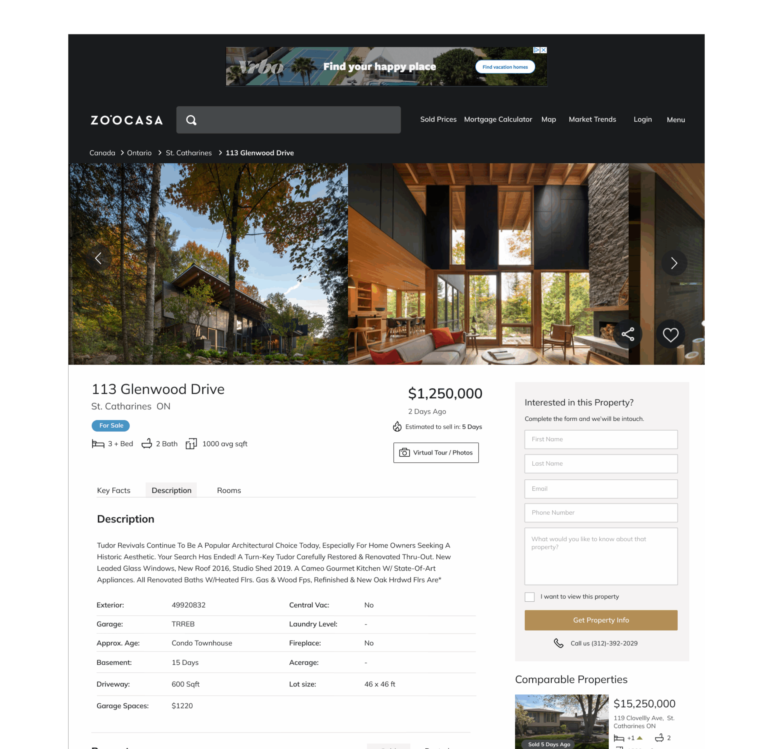
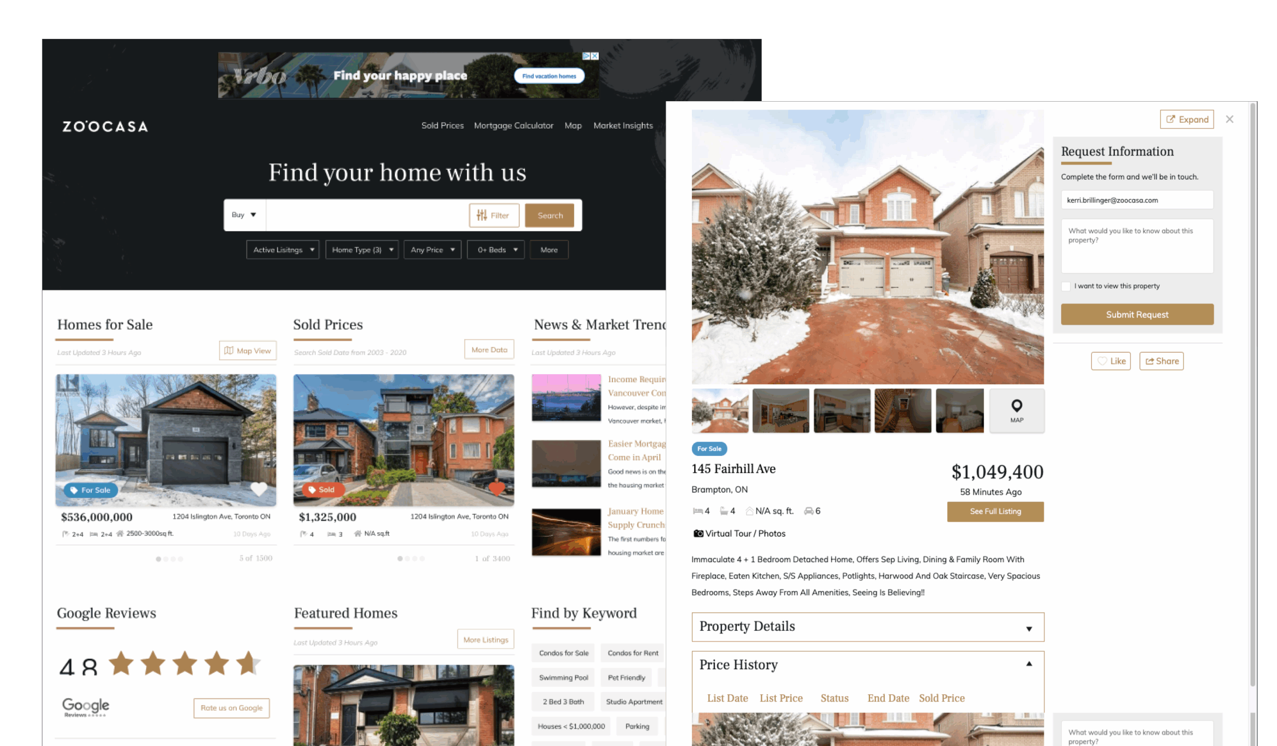
It was clear to us at Zoocasa that our property address pages were a bit like the grand entrance to a home – absolutely crucial. This was where users, after a hopeful click on a map or listing, came to really meet a property. But, if we were honest, our entrance was a little cluttered, a bit dated. We’d given it a fresh coat of paint with our new branding, but underneath, the old bones weren’t serving our users as well as they could. You could just glance at competitors like Zolo or Zillow and feel that pang – we knew we could do better.
Info
- Project: Redesign of the Zoocasa Property Address Page
- Role: Lead Product Designer Duration: 4 weeks (Design Phase), 2 weeks (Dev Phase)
- Date: Launched April 2021
Our mission, as I stepped in as Lead Product Designer, was clear: how could we make this page sing for our users? We imagined someone, probably a Millennial like many on our team, phone in hand, trying to quickly decide, “Is this the one? Should I even bother an agent?”
That thought became our guiding star: “As a user, I want to see key information about a property easily so I can make a decision if I want to contact an agent to view it.”
✍️ The stakes were twofold: happier users who found what they needed without fuss, and more of those happy users connecting with agents – a win for everyone.
❌ But we had some hurdles: key info felt buried, our photos were too shy (small and not immersive enough), and that all-important “Request Property Info” button wasn’t getting the clicks it deserved.
🔍 Our Research
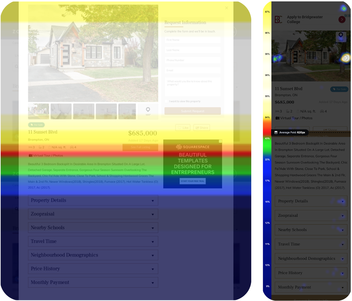
So, we first played detective. With tools like CrazyEgg, we spied on how folks were actually using the page. It was eye-opening! Turns out, hardly anyone bothered with our carefully constructed tabs. They were, however, all over the photos, flicking through them like mad. And if something wasn’t visible without scrolling? It might as well not exist. This “above the fold” mantra became our new best friend.
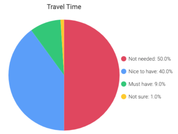
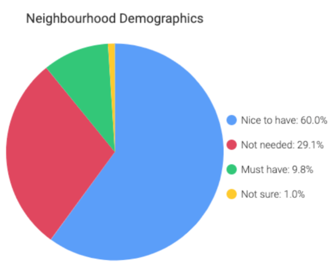
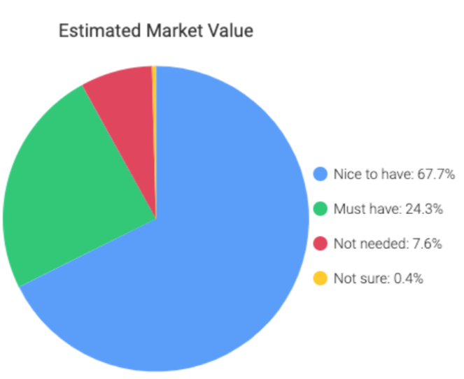
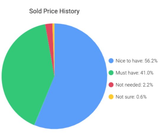
Next, we just asked. We had our hunches – price, location, beds, baths – but a survey confirmed it. Our users screamed (politely, through checkboxes) for: List Price, Photos, Beds/Baths/Parking, and Past Sold Prices. Interestingly, commute times and schools, while nice-to-haves, weren’t the dealbreakers we thought.
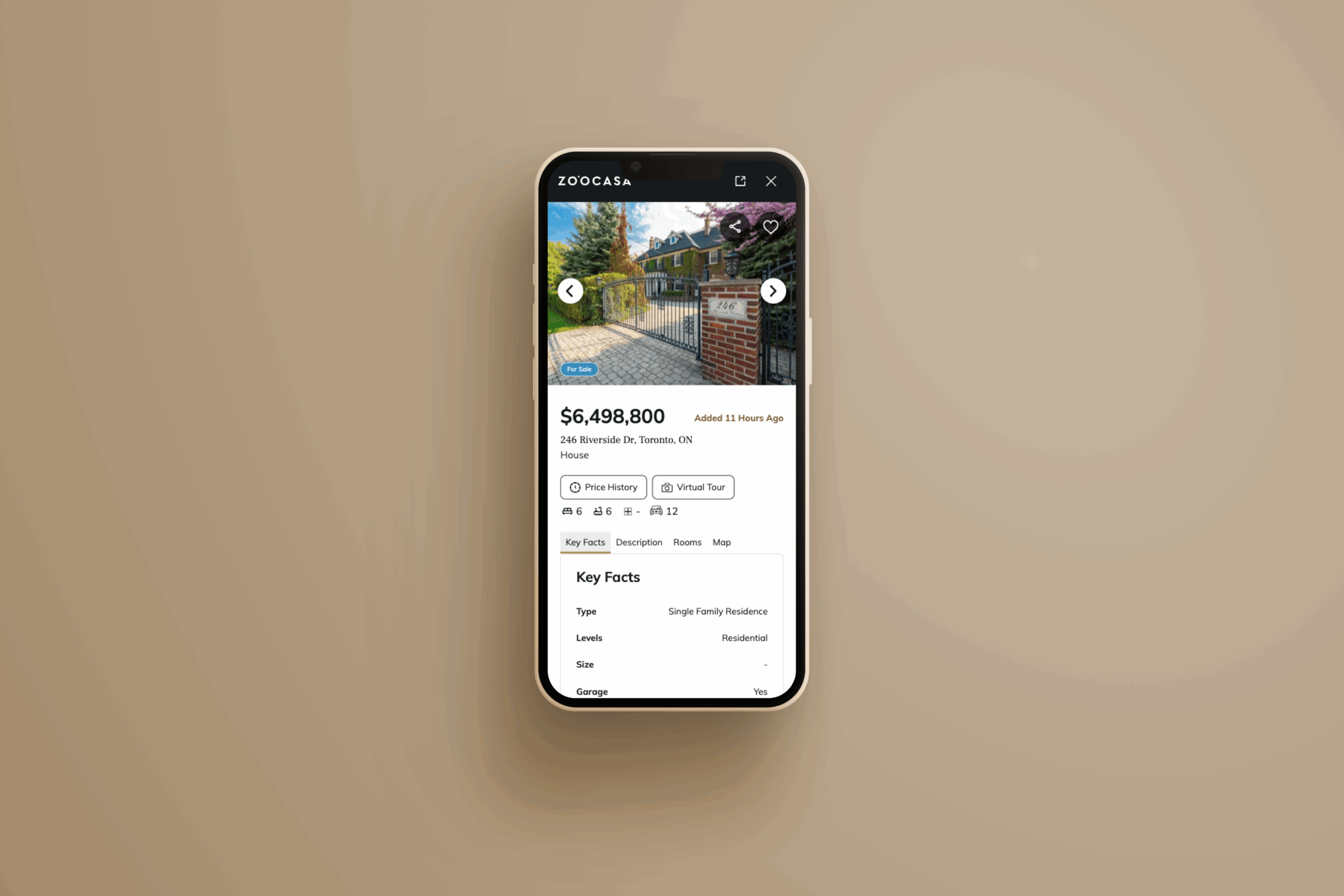
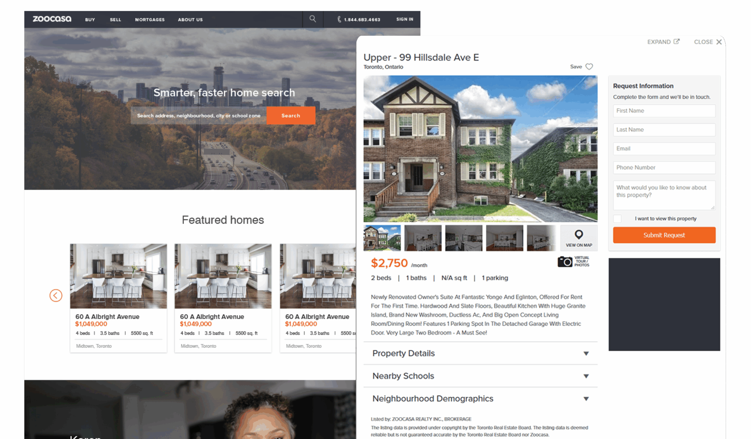
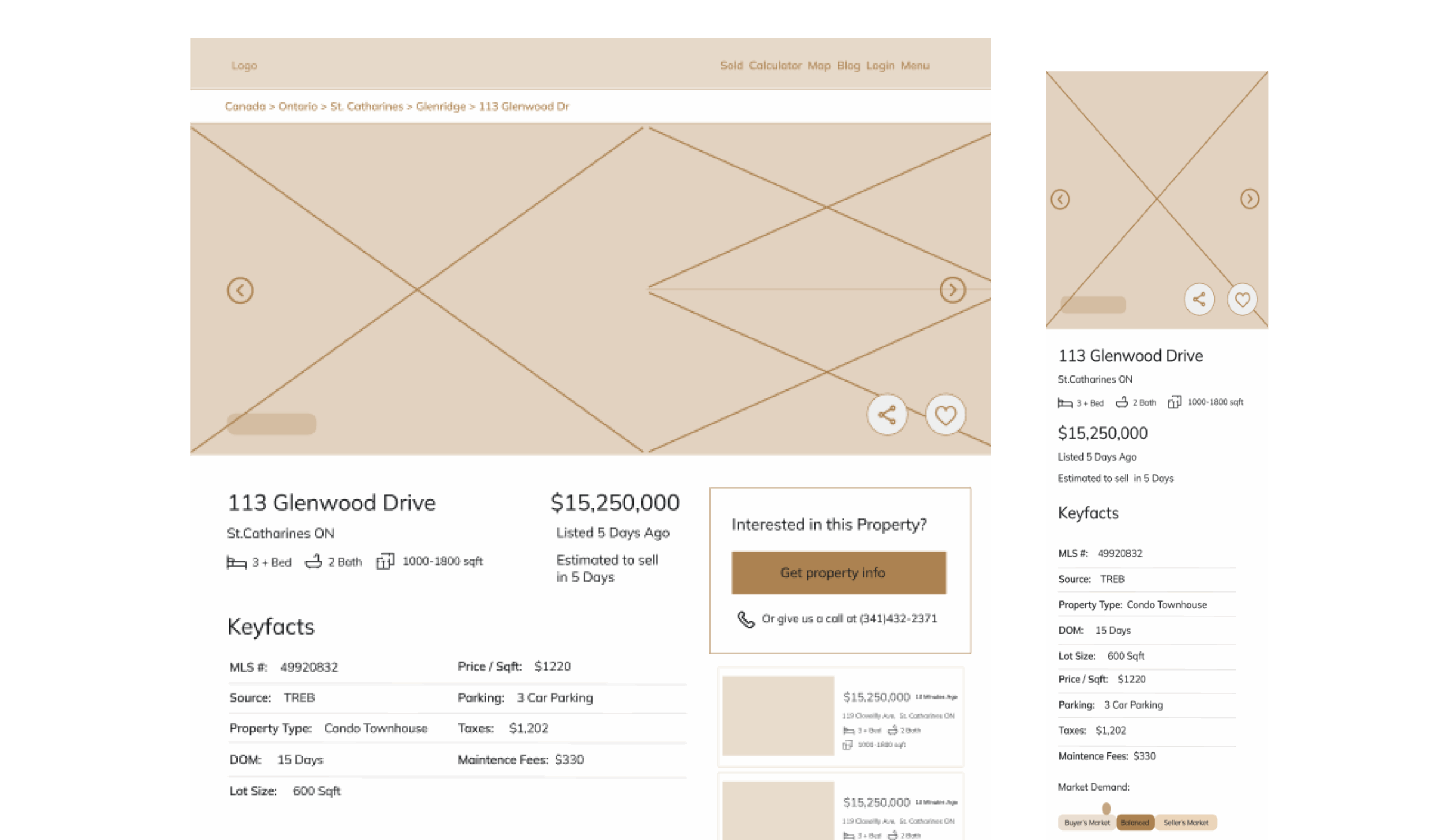
With this intel, our small but mighty remote team – a Product Owner, developers, and me – set to work. Armed with Figma and InVision, we dove into “Crazy 8s,” scribbling rapid-fire ideas. We peeked at what competitors were doing – Condos.ca had this slick full-screen photo header that we admired. My vision started to form: a big, beautiful, scrollable photo experience right at the top. If you can’t see the house well, why would you visit?
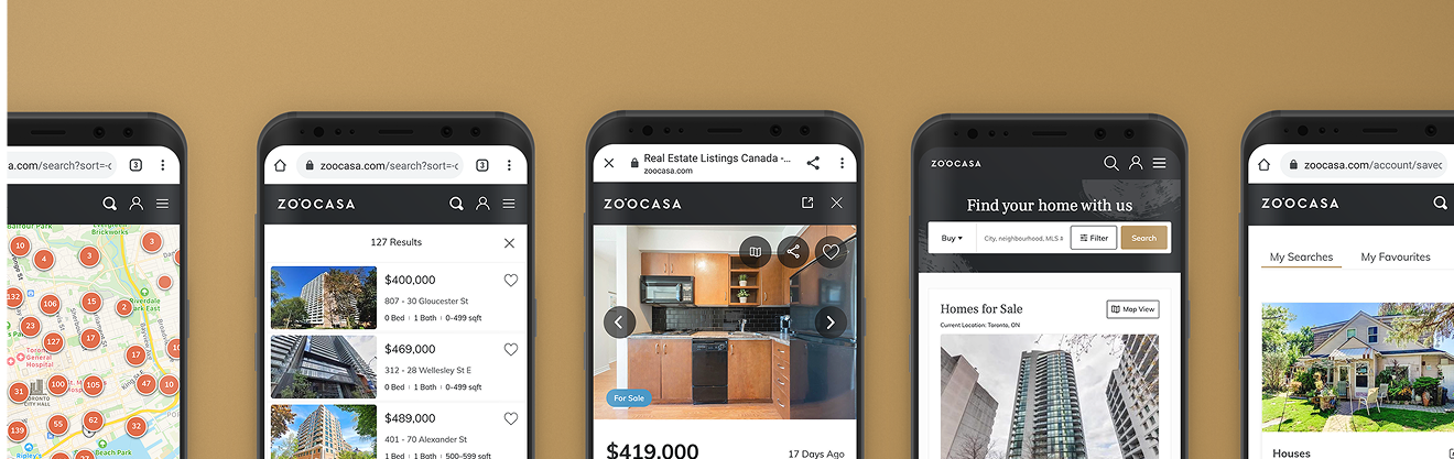
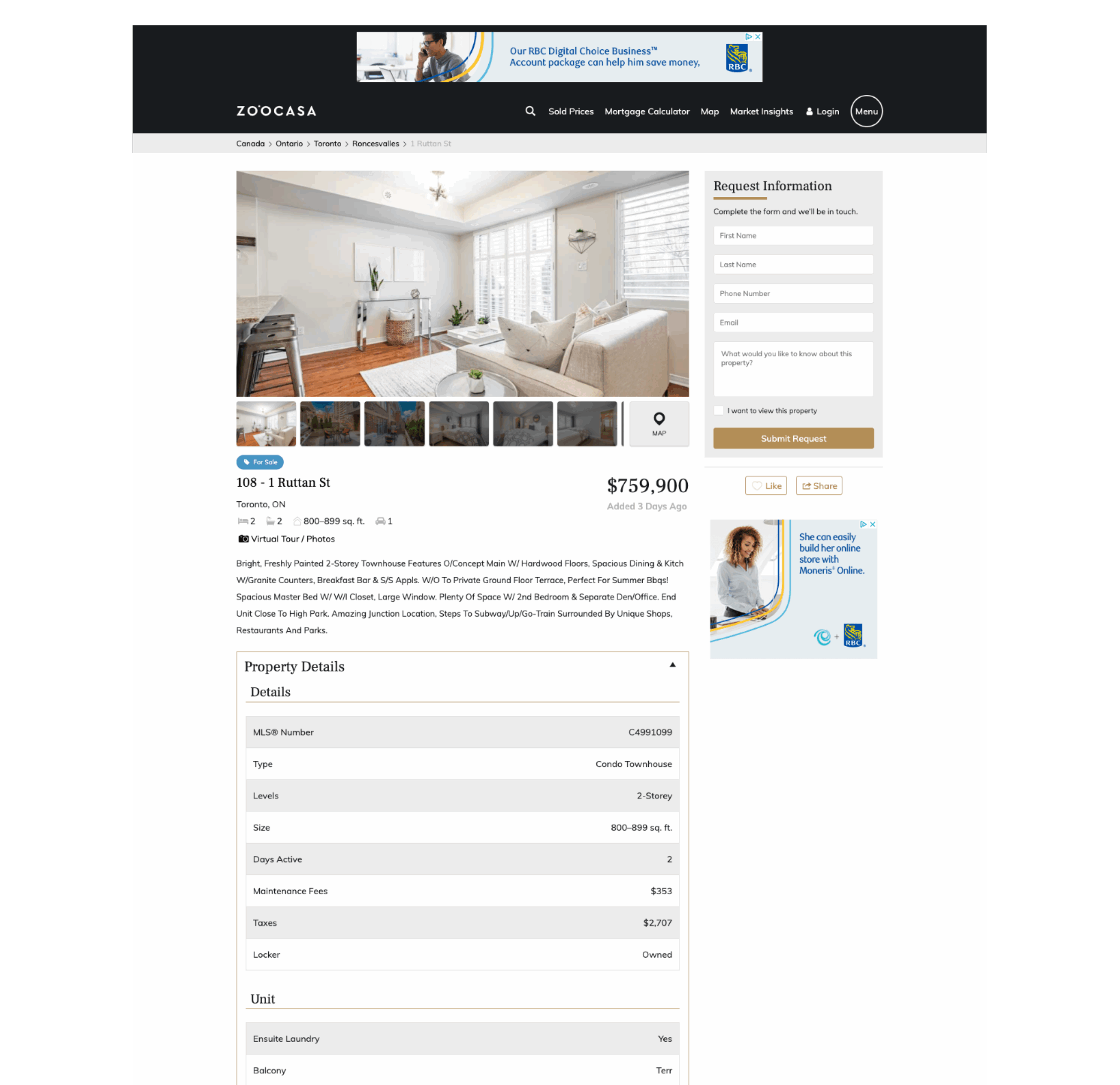
I roughed out some low-fidelity wireframes, got the nod from the team and bosses (who were refreshingly invested!), and then polished them into high-fidelity mockups. The aim was “clean and easy,” whether on a big desktop screen or a tiny mobile one.
Then came my favorite part: talking to people. We didn’t have a massive user testing setup, so I roped in new colleagues, sales agents, customer service reps, even my own family. “What do you think?” I’d ask, watching them navigate the new designs. The feedback was gold. They loved the cleaner look and the big photos. But they also asked, “Where’s the map?” and told us the “Request Info” button could have more oomph. One person pointed out that “Estimated to sell in ‘very soon'” was a bit vague. Fair point!
We took that feedback to heart. We cleverly tucked the map into the end of the photo carousel (or made it full screen if there was only one photo). We added a quick jump link to the price history, knowing it might otherwise be a long scroll away.
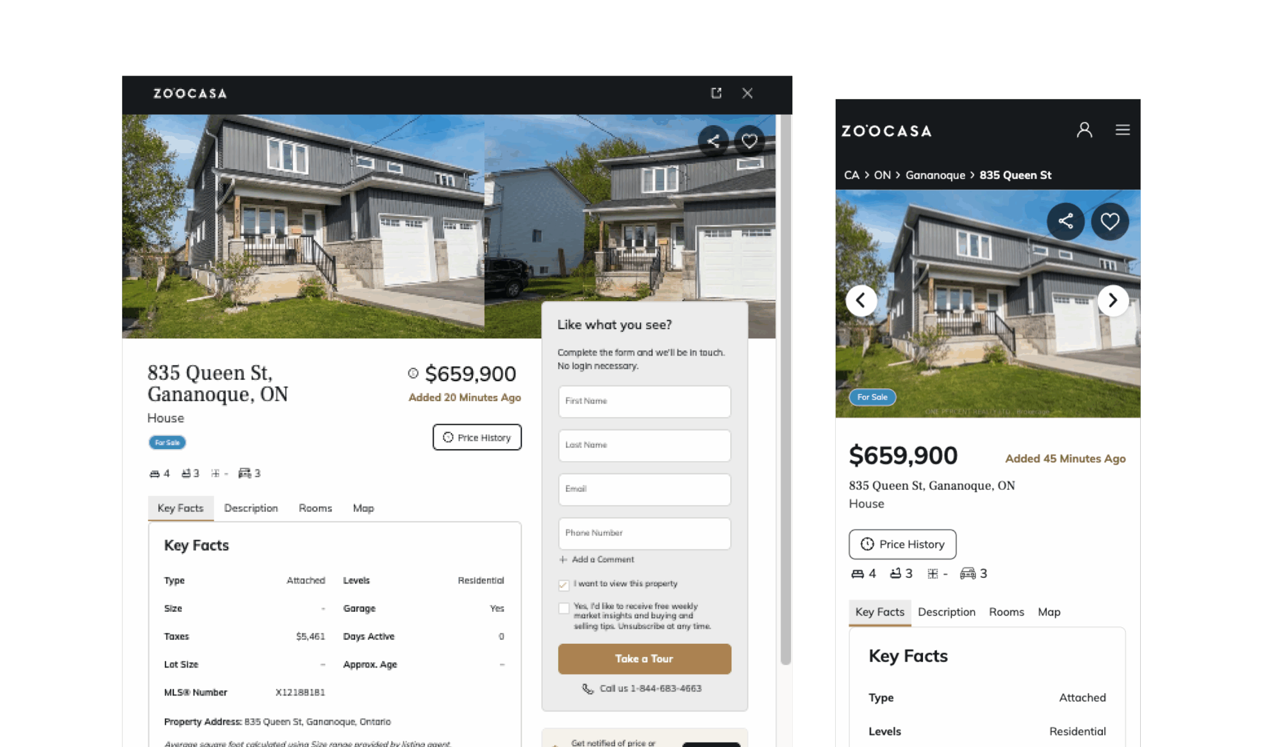
Finally, in April 2021, our revamped address page went live. It was a big moment. This project wasn’t just about a prettier page; it was one of the first times we truly put a deep UX process front and center, with proper research and iterative testing. The positive feedback started trickling in, and it felt good. We’d not only improved a crucial part of Zoocasa but also leveled up how we approached design itself. It was a reminder that listening to users and taking them on the journey with you is always the best way home.